UI Animation: Everything You Need To Know
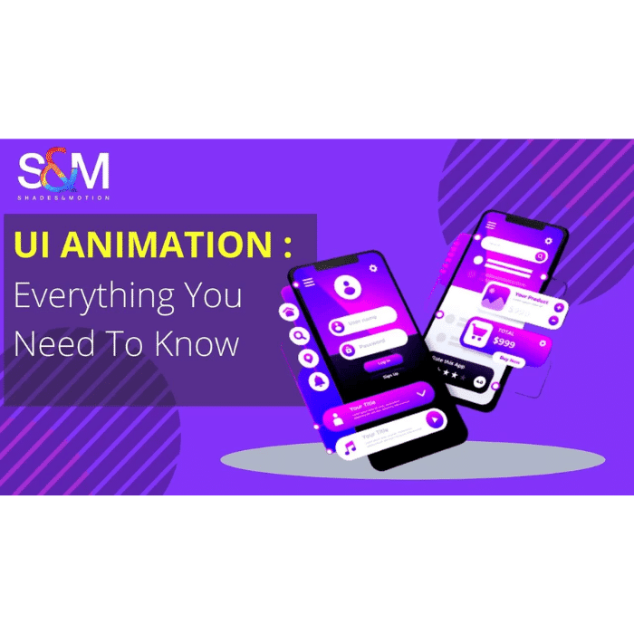
UI animation is the process of adding motion to UI elements in order to improve the interactivity of a product. Among other things, UX and UI designers use animation to guide users around the interface, alert users of a change, influence users’ decisions, and indicate a relationship between elements.
Let’s continue the discussion about how conceptual animation affects product success by talking about UI animation and its advantages for apps and websites.
1. Key Benefit of UI Animation Concepts
In fact, in almost any industry or creative field, the creation and research of something innovative begins with a concept. Consider the automotive or architectural industries, and consider how new art directions have appeared and developed throughout history. Whatever the field, the attitude towards concepts will range from “that’s just a fantasy with nothing to do with real life” to “why not…” Both alternatives are viable. Still, concepts from the power makes progress possible, for better or worse.
The same thing is happening in the field of UI animation. Most animations that we now take for granted as an integral part of our interfaces were once considered “unreal” concepts. In the age of flat design, when shapes and colors strive for simplicity and cleanness, animation becomes the tried-and-true method for making apps and solutions stand out in the face of fierce competition.
2. Types of UI Animation
UI animations are classified into four types:
- Loading and progress
- State changes
- Navigation
- Microinteractions
- BRANDING
LOADING AND PROGRESS
Loading : an animation demonstrating to the user that the system is operational. For example, a loading animation (throbber) or percentage indicator indicating to a user that a product is busy loading a page or processing information. These loading UI animations are critical because without them, users may believe that the product or website has stopped working, leading them to abandon the product before it has even begun to load!
Progress: animations show users where they are in a flow and how much work is left to do.. A progress bar at the top of an eCommerce checkout flow animates as the user moves closer to completion.
State Changes
Designers frequently use animations to communicate the state of a digital product or element.
For example, until a user fills out the required form fields, a button may remain dark and unclickable. When the form is completed, the button’s state changes to active (or clickable), indicating that users can proceed by clicking the button.
Structure & Navigation
Navigational UI animations assist users in navigating user interfaces and finding what they are looking for. Designers will use animation to show users which page or tab they are on, or they will create page transitions to indicate which way they are moving.
UI animation is also useful for communicating navigational hierarchy so that users understand the structure of the product or website, resulting in a more enjoyable user experience.
Microinteractions
Based on user interaction or system changes, microinteractions provide feedback and information. This feedback and information are almost always accompanied by some form of UI animation.
A mobile text or message notification is a common microinteraction. When you receive a text message, a popup alert appears on your phone. In some cases, the alert will display the entire text message before minimizing it to display the sender’s name.
Branding
Animations are an excellent way to increase brand awareness and user interaction. Fun logo animations are frequently used by designers to give the brand a lighthearted, welcoming appeal.
3. An E-commerce UI Animation That Gives Users Control
With our understanding of users’ needs constantly evolving and the demand for edgier, more unique interfaces higher than ever, UI designers have significantly improved their animation game in recent years. There has never been a more exciting time to push the boundaries of motion in UI, from experimenting with colour palettes to lifelike 3D animations.
Ex- Dannniel, a Dribbble freelance UI designer, employs UI animations to provide users with a sense of control while shopping online. Dannniel created an interface where users can learn basic information about a shoe in an animation UI design concept for a shoe seller (such as price and reviews).
Dragging to the left will open a screen overlay (while simultaneously activating several UI animations) where customers can select their preferred size and color.
4. UI Animation Concepts in Realistic Interfaces
Conceptual animation is one of the creative stages of user interface design: motion designers may present various options for clients and developers to consider.
Examples:
- moving down a list of things
features interaction with a list of items: the right variant simulates pulling cards with a slight holdback, while the left variant simply moves the entire list up. The second version has a more vibrant appearance and makes scrolling more enjoyable. The right concept also supports the perception of more air in the interface by giving the appearance of more space between the cards.
- moving from a list to an item
The right option adds dynamics to the process, while the left one demonstrates the fundamental method of moving from a list or menu to a specific item screen.
- side menus are opened
A conceptual animation may also give such a simple action as opening a side menu life and dynamics. The process is made to appear more elegant by the designer using a gradual flow of featuring the objects.
Realistic Interfaces with UI Animation Concepts
Conceptual animation is one of the artistic phases of user interface design; a motion designer may present a variety of options for clients and programmers to consider.
5. Benefits and Disadvantages of UI Animations
When we think of interface animations, we immediately think of several advantages, such as:
Increase usability; originality and creativity; facilitate interactions; provide instant feedback to users, creating helpful expectations; and keep user attention on important elements.
However, despite their numerous advantages, animations should be used with caution. Otherwise, they may end up bringing some disadvantages.
Consider the following issues in this context:
Loading time: If your animations are large, the interface may take longer to load. As a result, this waiting time can be detrimental to the user experience; animation overload: every movement within an interface should serve a purpose. As a result, creating an excessive number of animations to attract user attention may not be a good strategy. An overburdened interface can become tiresome and drive users away.
6. How UI Design Can Help You Achieve Your Goals
The design of the user interface is referred to as UI design (UIs). The look and feel of websites, apps, and other user interfaces are all part of UI designs. It can also include designing web pages, logos, signs, and other website or app elements.
The goal of user interface design (UI designs ) is to create a user interface that is both effective and efficient. It takes into account several aspects of the user experience, such as usability, visual appeal, and overall functionality. You can help ensure that users have a positive user experience (UX) with your product or service by carefully crafting each aspect of the UI.
7. How to Choose the Right Design for Your Project
When selecting a design for your project, think about what you want your users to do with your UIs. For example, if you’re creating an app for people outside your company, you might want to go with a more traditional design rather than one designed specifically for website visitors. If you’re designing an app that will only be used within your company’s walls, you may want to go with a more sleek or modern design.
8. There are some types of UI designs:
Static
Static UI designs are the most basic and widely used type of design. They are typically created with a tool such as Adobe Photoshop or Sketch and then exported as image files for use in web or app design.
Icon Design
Icons are graphics that clearly and concisely represent an idea or concept. Icons are frequently used as logos for businesses or organizations, and they can describe specific topics or ideas on a website.
Menu Design
Menu design is in charge of creating the menus that visitors see on a website. A menu should provide quick access to all of the site’s content while also providing enough variety to keep users interested. Menu designs are available in both online and offline formats and can be designed in any style you desire (buttons, dropdown menus, select boxes, etc).
Menu Bar Design
Menu bars are similar to but not the same as menus in that they do not provide easy access to all of the site’s content. They, however, visually separate other areas of a web page. They are available in both online and offline formats and can be designed in any style you desire (buttons, dropdown menus, select boxes, etc.)
Conclusion
The UI Design process can assist you in achieving your business objectives. You can create a sleek and professional UI that stands out on the web by selecting the right type of design, resolution, graphics package, and font package. Furthermore, by selecting the appropriate size and dimension for your project, you can ensure that your user interface is effective and efficient.
FAQs
Q. What is UI Animation?
UI Animation transports users between navigational contexts, explains changes in element arrangement on a screen, and reinforces the hierarchy of user interface elements. Animated effects are an important part of interaction design.
Interaction design, on the other hand, combines information architecture, visual design, content, architecture, industrial design, human factors, sound design, and human-computer interaction.
Q. What are the five different types of animation?
- Motion graphics
- Stop motion
- Hand drawn
- Vector
- 3D
Q. What makes a good UI animation?
When a concept becomes a reality through animation, it is said to be good. It occurs when the user believes in your concepts. It must be perceptible, natural, and credible in the user’s eyes.
None of it should imply that it is false. A waving flag, for example, should follow the rules of wind direction. A falling ball must obey gravity’s laws.


Leave a Reply